Sam Falls Light over Time
About Exhibition
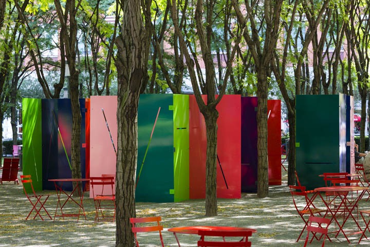
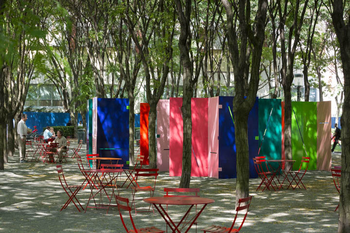
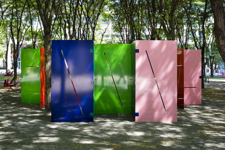
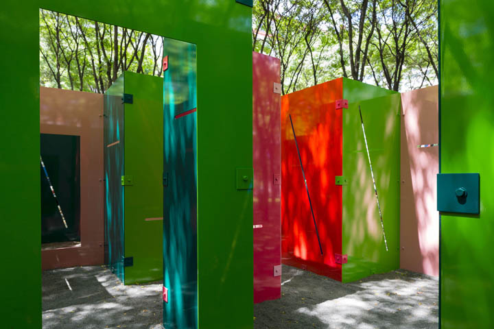
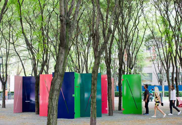
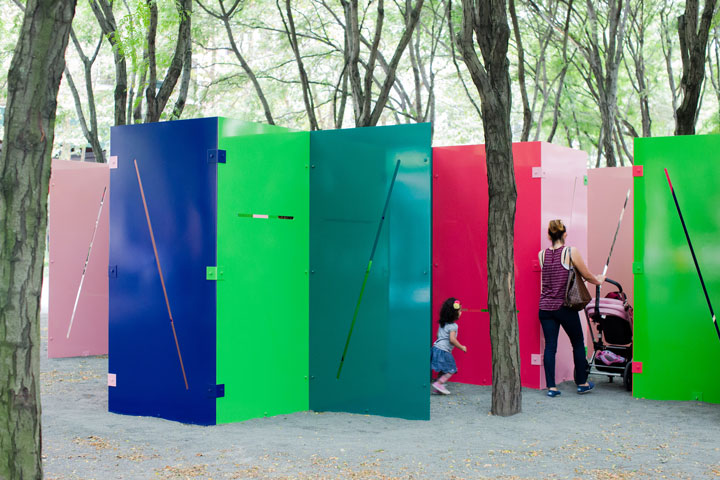
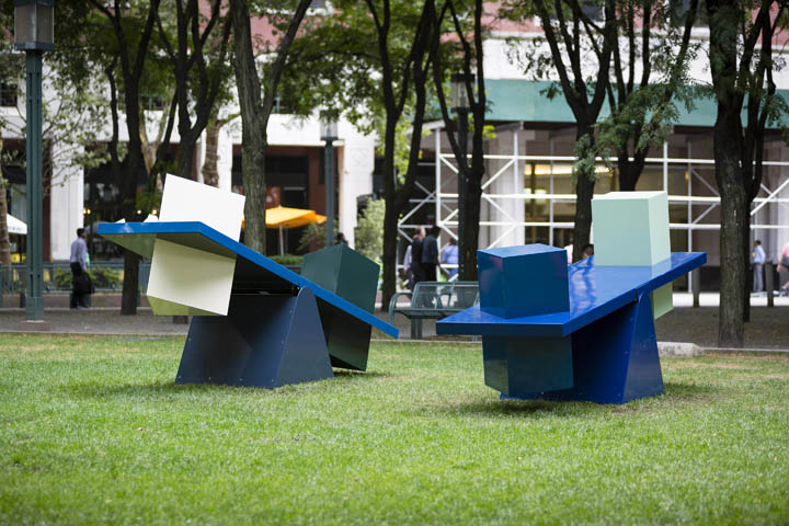
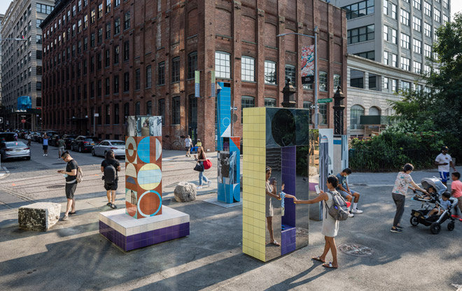
Sam Falls creates works of art that incorporate a playful yet conceptually rigorous approach to material and process. Interested in the nature of photographic exposure and representation, Falls has experimented with the long-term effects of sunlight, rain, and temperature on such diverse materials as painted aluminum, heat-sensitive tiles, and colored glass, as well as fabric, copper, and marble. In Light over Time, works like Untitled (Maze) and Untitled (Scales) are painted in select areas with UV protective paint, leaving the untreated surfaces to fade as they are exposed to the elements, marking the passage of time.
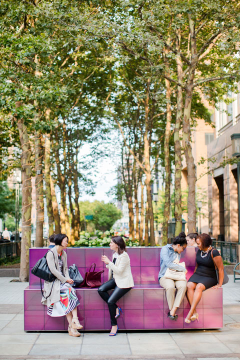
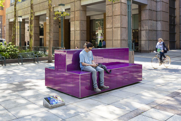
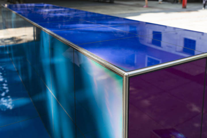
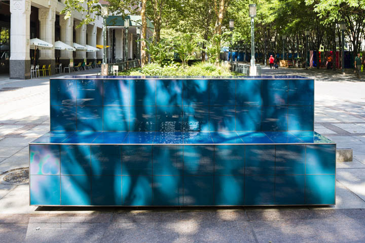
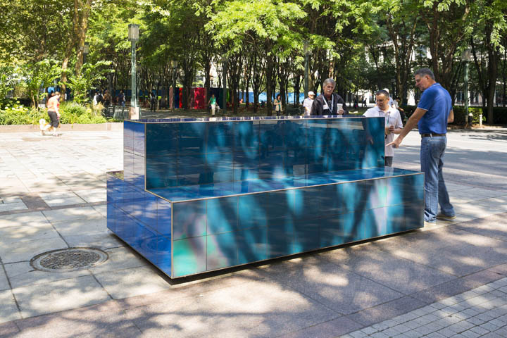
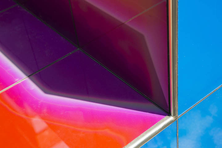
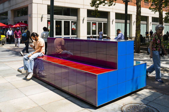
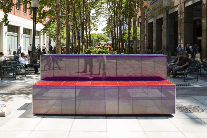
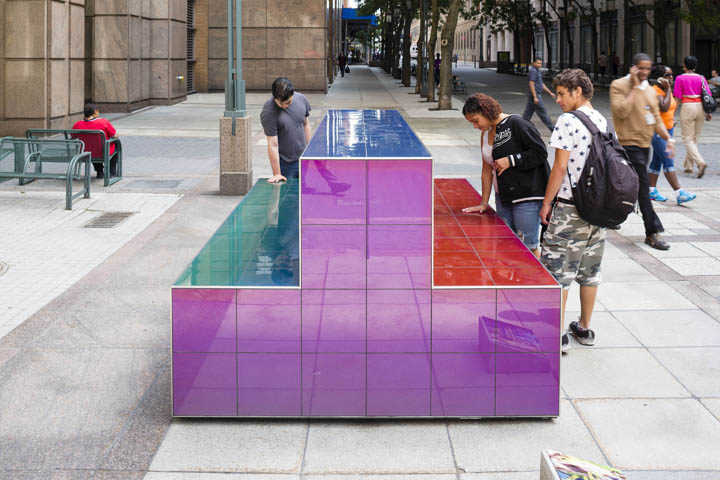
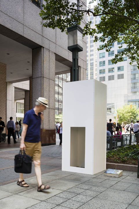
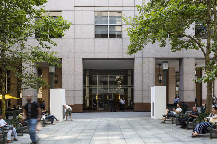
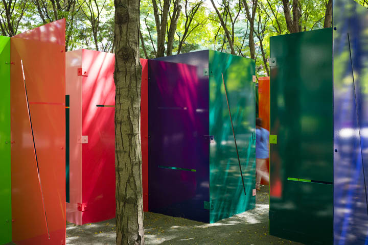
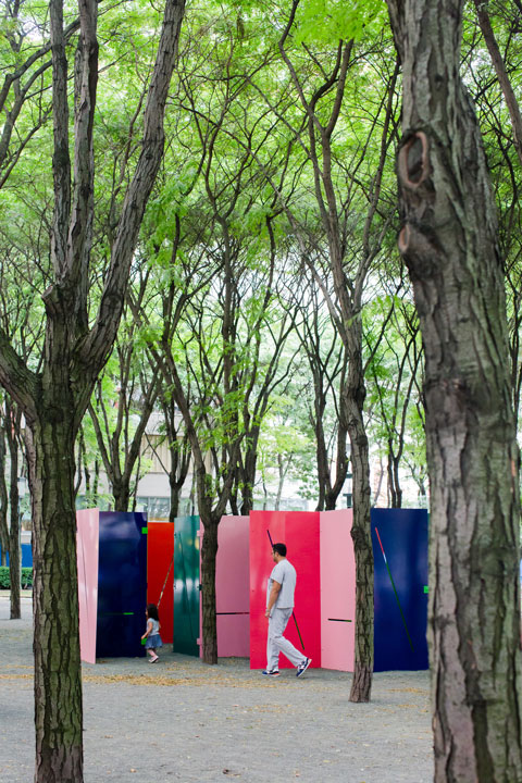
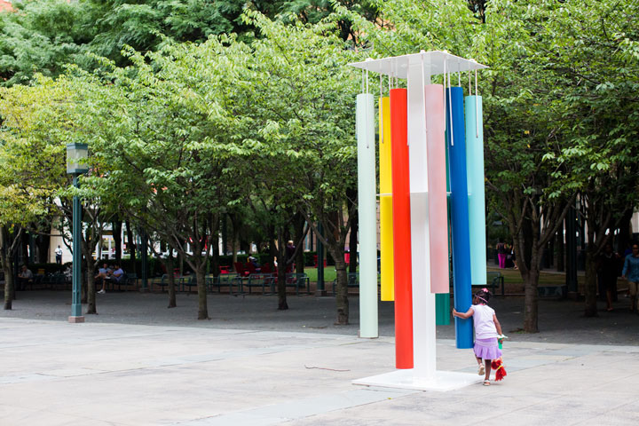
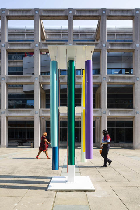
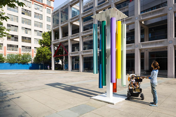
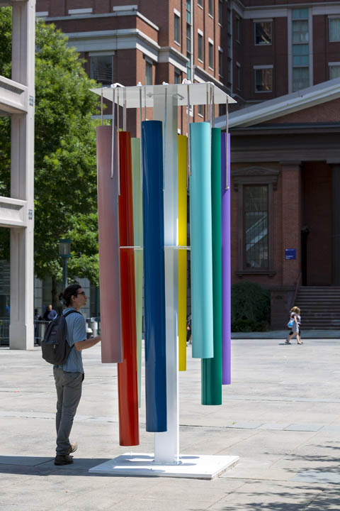
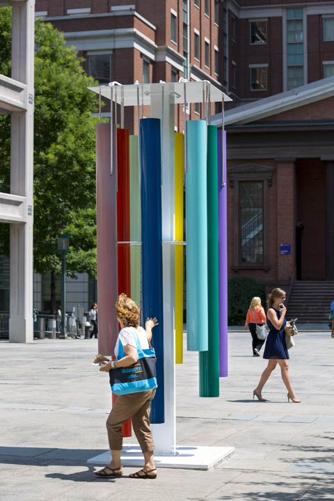
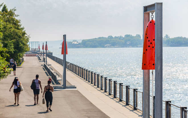
Falls is also interested in the role of the viewer, creating works that are experiential and interactive. On the Commons, Untitled (Wind chimes) reveals new colors beneath the surface of the painted clapper when played. Similarly, shadows, light, and body heat transform the colors of Untitled (Thermochromatic bench) as the tiles respond to changing temperatures. Untitled (Light rooms) and Untitled (Maze) encourage curiosity and interaction, inviting us to enter the sculptures to fully experience them. Combining forms that reference familiar objects such as windows, benches, and playgrounds with natural processes, the artist draws attention to the passage of time and our engagement with the objects around us.
Sam Falls: Light over Time is curated by Andria Hickey.
Photo Gallery
Artist Interview
Andria Hickey: Can you share some of your thinking about the title of the exhibition?
Sam Falls: The title of the show, and the concept it references, is an undercurrent in all of my work. You could also say that the nature of representation and temporality, or art and life, is a through line that connects different avenues of material exploration. I use photography as a starting point and as a reference because it’s the best tool for representation—light is how we see. Temporality defines life for me, our growth and movement forward; and our aging and death. Light over Time not only describes the process involved in making the work, but also functions on a more metaphorical level as it relates to my engagement with aesthetics and creation. Some of the works in the show function more with light, some more with time, or like the maze, symbiotically.
AH: The maze is a new, large-scale work that is one of a number of powder-coated, modular-paneled sculptures you have created over the past few years. How do these works change over time?
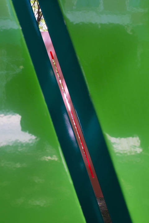
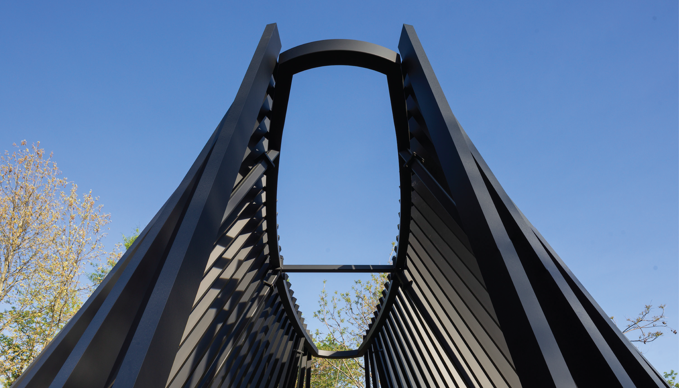
SF: The maze will age and fade on one side over the years as the sun hits the side of the panel lacking a UV protective element, while the other side of the panel that has the UV protection will remain unchanged. Over time, the light will fade the interior of the sculpture with an image created by the shadows of the sculpture itself so that a gradient will emerge, depicting the passing of time as well as an image of the sculpture imprinted on itself. It’s a durational piece that mimics organic degeneration while also growing to its full conceptual development. As more time passes, a layer of protected pigment that exists beneath the unprotected UV pigment will emerge and sort of rebirth the sculpture, bringing it back to its original form as the outer layer fully fades away.
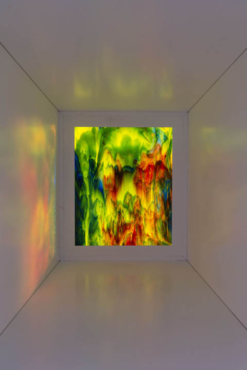
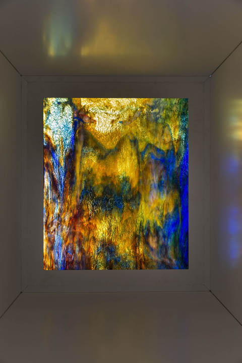
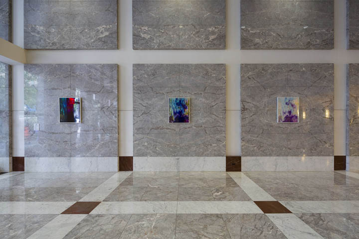
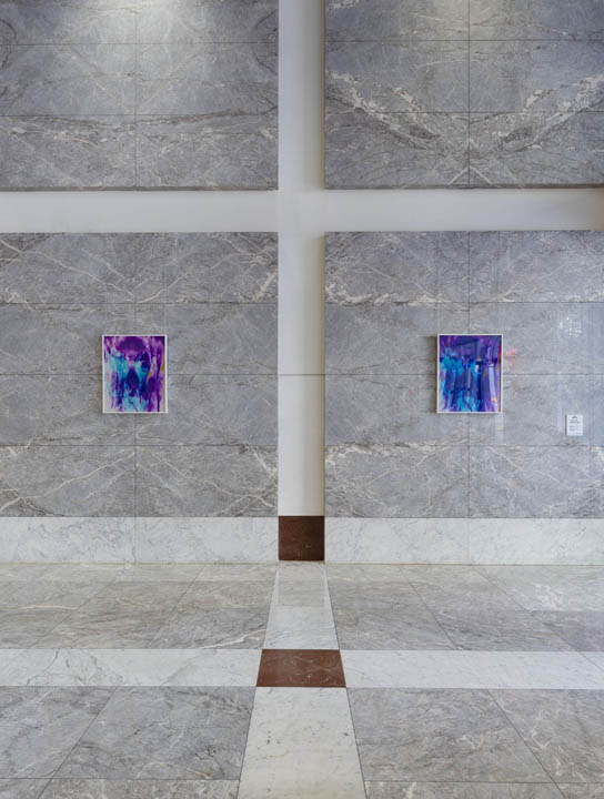
AH: The “light rooms”—two human-scale rectangular shelters with marbled glass ceilings—have a very different relationship to light and exposure, as do the five related photograms that are installed inside One MetroTech Center. What is the relationship between these works and the photographic process itself?
SF: The light rooms project the color of the stained glass within the small room everyday. Depending on the brightness of sunlight, different colors will be more visible at different moments, reflected within the room. The reciprocal of these rooms are the color photograms. These are made in the darkroom with the exact glass from the sculpture so that you see the image of the colors in the glass preserved in photographic form. Of course, because it was made in the darkroom the colors are a negative inversion so blues become reds, greens become purples, etc., and the natural light creates a kind of mechanical reproduction. While you see the abstract light glowing in the room in true color, you see a descriptive reproduction of the glass in photographic color in the framed print. Also to be noted is the fact that natural glass as a chemical compound never stops moving and so in a hundred years the photograph will look the same, but the pattern on the glass will look different. The fact that the glass changes over time and the photograph as a record becomes illegitimate is just an added bonus.
AH: When you were developing this exhibition, we talked a lot about MetroTech Commons and how people tend to use the space. How did the idea of interactivity take shape as you conceived the show?
SF: One of the things we originally talked about was playgrounds, which was an exciting concept in many ways, especially in terms of form, material, and space. Over time I wanted to focus on a sort of sensual interaction rather than physical; abstracting the notion of interactivity as it exists in the public realm with the idea of playgrounds and gyms as a catalyst. A big issue for me is creating a direct line from the artwork to the viewer, without much material or artistic mediation getting in the way. So, the success of an artwork depends on how it can translate an idea through the viewer’s experience—without having to step in with the artist’s personal idiosyncrasies or histories. Usually I do this visually, but given the nature of the space at MetroTech, it was nice to think about how vision works with other sensory elements like sound and temperature. Ideally the exhibition as a whole moves the viewer through an experience that is informed by everyday objects like windows and benches, but leaves them with a more enriched impression of our movement through space incorporated with natural elements, industrial objects, and our bodies.
AH: How did you select your color palette for these works? Is there a particular logic behind the choices?
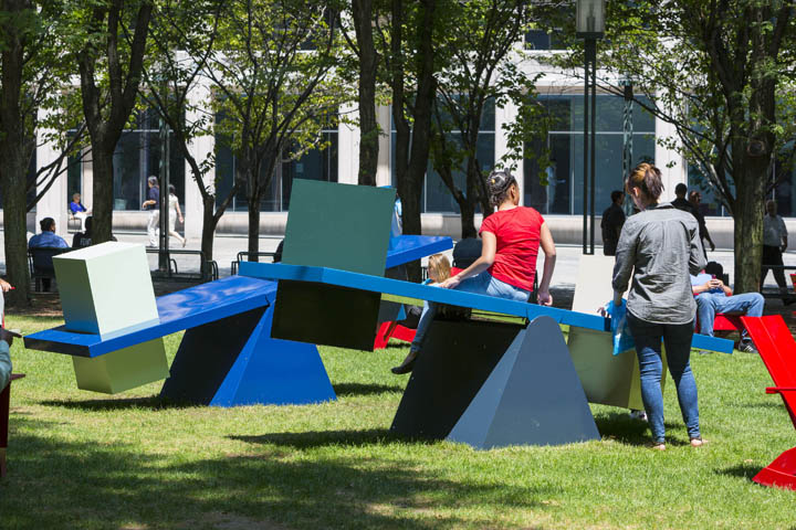
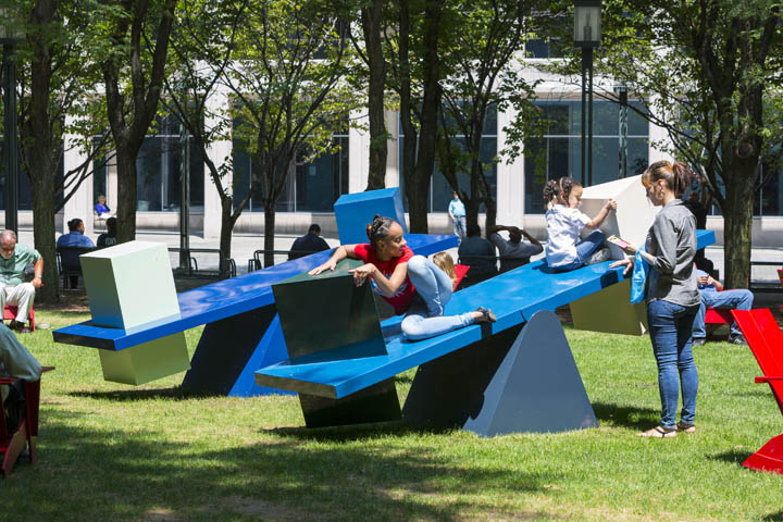
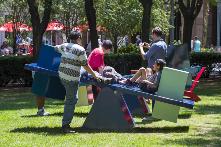
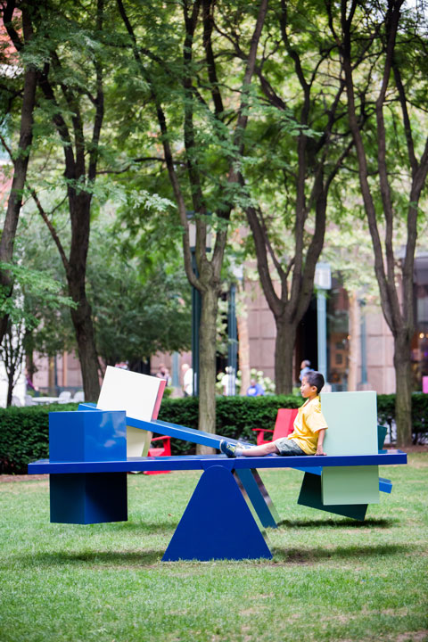
SF: I wanted the maze to be inviting and draw viewers into an experience with it, to encourage moving toward it and through it; so here I used brighter, more playful colors. For the wind chimes I used lighter but subdued colors to give it a relationship to the lightness of wind and more earth-toned natural colors, as well as distract from its material weight and draw attention to its lightness of function and form. I applied the same ideas to the scales, making the objects lighter and the plinths dark, to create the appearance of weightless forms on a ground, when in fact these forms will gather water and weight.
AH: The objects in this exhibition are recognizable and familiar—a seesaw or scale, a maze, a small square room—but their geometry and shapes suggest a relationship to Minimalism. What draws you to this history?
SF: My interest in Minimalism came out of a desire to distance the artist from the artwork, to make room for the viewer. Specifically, I was interested in how Minimalism attempted to make the viewer more aware of the space they occupy and the space surrounding them. I find that a lot of the forms and designs drawn from Minimalism are still well suited for achieving a direct relationship between the viewer and the object, without interference. But I also find that there are ways to incorporate a friendlier and more encouraging dialogue with organic counterparts and optional aesthetics like color. Minimalism as a form can be intellectual as well as human, not just smart and cold. When we are out in the world, we are surrounded by Minimalist inspiration drawn from and then back into industrial application. So to deal with the grid and right angles in works dealing with nature, we can light up our acknowledgement of the city and essential environmental elements like the sun and rain.
AH: Many of your works presented in traditional gallery settings are actually destined to be displayed outdoors. Does your process change when the works are designed for an outdoor exhibition at the start?
SF: Not at all really—but the scale increases a bit and the installation is much easier! That is, I work outside so much with a lot of my other, more two-dimensional work, that my scale has come to interact more with those specific surroundings, like fields and parking lots, cars and trees, so the sculptures too are made with these ideas in mind, propositions to nature and the city.
About the Artist
Sam Falls (b. 1984, San Diego, CA) lives and works in Los Angeles. His work has been shown at LAXART, Los Angeles; Museo MADRE, Naples, Italy; International Center of Photography, New York; American Academy in Rome; Fotografiska, Stockholm; and the Woodstock Center for Photography, NY. Exhibitions of his work have been presented by Guiliani Foundation, Rome (2015), Ballroom Marfa, TX (2015); Hammer Museum, Los Angeles (2015); Zabludowicz Collection, London (2014); and Pomona College Museum of Art, Claremont, CA (2014). His work is in the collections of the Museum of Contemporary Art, Los Angeles, and the International Center for Photography, New York, among others. He received his BA from Reed College and his MFA from ICP-Bard. He has self-published more than ten books, including Color Dying Light (Hassla, 2009), Dans la Chambre Verte (JSBJ, 2010), Light Work (Gottlund Verlag, 2010) and Visible Library (Lay Flat, 2011). Falls is represented by Galerie Eva Presenhuber, Zurich, and Hannah Hoffman Gallery, Los Angeles.
Sam Falls: Light Over Time at MetroTech Commons is part of an ongoing program organized by Public Art Fund, and sponsored by MetroTech Commons Associates and MetroTech companies including Forest City Ratner Companies, JPMorganChase, National Grid, WellChoice, and Polytechnic Institute of New York University. Special thanks to Forest City Ratner Companies and First New York Partners.
Additional support is provided by Hannah Hoffman Gallery and Galerie Eva Presenhuber.
Special assistance with Untitled (Thermochromic bench) has been provided by Moving Color Studios.
Public Art Fund exhibitions are supported in part by the New York City Department of Cultural Affairs in partnership with the City Council.
